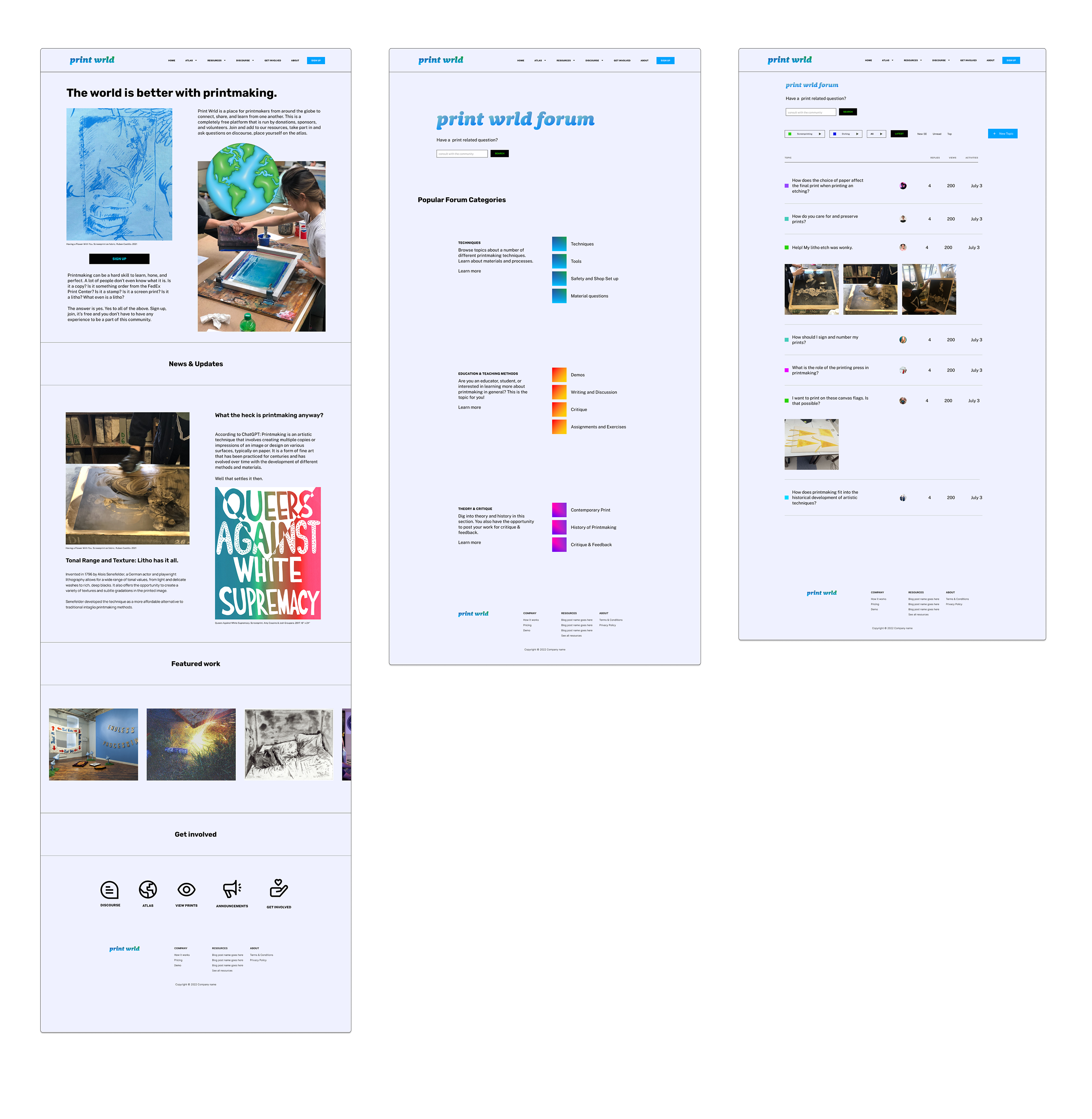
Print Wrld
A place for printmakers from around the globe to connect and learn from one another.

Prototype
Printmakers are a social bunch. We're used to often figuring things out around a communal press, share ideas, and celebrate meaningful artworks.
Printmakers need a place to share and archive ideas, projects, find community around the globe, and multiply the number of people in their circles.
Print Wrld is the place to do that.
I chose to do this project because printmaking is my first love and traditional social media is falling short when it comes to helping each other problem solve. It seems to be a place that is more conducive to the now, rather than archiving and filtering meaningful print discussions that can be used in the future. This mobile-responsive website is part of my work for DesignLab's UX Academy.
My Role
UX Designer
UX Researcher
Timeline
80 hours
Tools Used
Figma
Photoshop
Illustrator
I interviewed four different people to evaluate and learn about the needs of contemporary printmakers. Two participants were printmakers in academia, and two existed outside of academia.
Patterns included the need for community, and access to resources and opportunities.
data points that indicate the need for accessible and supportive resources. These include free educational materials and financial & institutional support.
data points that indicate community and being community minded is important to printmakers.
I started my wireframe process by hand drawing sketches as a way to explore different components, layouts, and flows in a more focused way.
Exploration of a discussion board and forum for printmakers, as well as a map to find other printmakers.
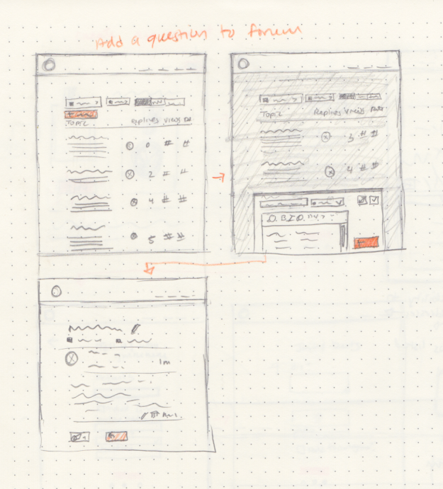

While building out my wireframes, I thoroughly examined and studied other discussion forum platforms and found patterns and helpful navigation tactics.


While building out my wireframes, I thoroughly examined and studied other discussion forum platforms and found patterns and helpful navigation tactics.
I conducted 5 usability tests of the prototype. My goals and objectives were to see how people interacted with the Print Forum feature
User completes task with relative ease and no significant errors.
User completes each task in a reasonable time frame.
of users thought that the font was too small, and they wanted clearer hierarchy of text.
thought the intention of the landing page was unclear.


I designed a system and theme for a completely new product under my direction, including logo, color palette, and typography.
.png)

This project allowed me to build an end to end mobile responsive site from ideation to implementation. It was a great opportunity to think deeply about and research a niche community's needs and create a (hopefully) useful tool.


Social online spaces and systems are complicated and require thoughtful design to create a healthy space free from bullying. This, in turn, allows for a healthy way to share resources, ideas, and build on that knowledge collectively.