Engage: Learning Management System Redesign Challenge
Engage, the current learning management system at the University of Saint Mary, could use a refresh.
As an educator, COVID and our quick transition to remote teaching made it clear that a good learning management system can elevate teaching and foster new opportunities for the students, instructors, and the institution.
I chose to redesign the learning management system at the University of Saint Mary so that it is capable of meeting the needs of increasingly blended online and in-person learning environments, especially for a generation accustomed to visual web design and mobile apps.
What is a Learning Management System (LMS)?
A Learning Management System (LMS for short) helps to deliver content, to handle registering courses, with course administration, assists with skill gap analysis, tracking, and reporting. Learning management systems exist to enhance the learning process, and trends show that the number of LMS platforms are increasing as the demand for accessible and quality education continues to rise.
Project Overview
This project was completed in collaboration with the Educational Technology Committee, students, faculty, and staff at the University of Saint Mary in Leavenworth, Kansas. It is part of my work for DesignLab's UX Academy.
Collaborators
Ed Tech Committee, students, faculty, and staff at the University of Saint Mary in Leavenworth, Kansas.
My Role
UX/UI Designer
UX Researcher
The Process
01 - Research
Why is a robust LMS Important to institutional success?
E-learning allows schools and universities to deliver educational resources to students without the constraints of physical locations and instructor availability. Trends show that the number of LMS platforms are increasing as the demand for accessible and quality education continues to rise.
3.2 million college students are exclusively enrolled in online education courses, making online learning and teaching a significant opportunity for institutional growth.
A robust and user-friendly LMS is especially important for the University of Saint Mary as they work to meet the needs of many first generation college students and to help keep them engaged in their course work. Unfortunately, however, many first year students don't continue on to their education at USM.
An average of 62 % of University of Saint Mary students stay on to become sophomores after their first year, putting the freshman retention rates below the national average. (64%)
Analysis of Current Design
One of my first tasks was to complete a thorough walk-through of the current LMS and noted difficulties in navigation, hierarchy of information, and effective use of space.
.png)


Competitive Analysis
The competitive analysis process demonstrated that communication is at the forefront of these systems with progress indicators, customization, and the calendar as being key features.

Pros
Clear calendar with a due date tab.
Progress indicators: Learners can keep track of their own progress, identify next steps, and reach out for support.
Cons
Document focused, which could cause it to be visually overwhelming.
Pros
Robust array of features.
Notifications and calendars were clear.
Cons
Sometimes confusing to navigate.
Lacks gamification and progress indicators for students.

Pros
Offers announcements, chat, email, and forum features.
Assignments - variety of options and settings, including peer review and group submissions.
Integration with external apps.
Cons
Cumbersome for large classes.
Not many progress indicators.
Key Takeaways
Key themes on each platform include progress indicators/status updates, in-platform messaging, integration with external apps, and calendars. However, I feel that there is an opportunity to create a more organized system for educational resources and course content. Many times, the platform looked cluttered with resources, which made it visually overwhelming.
02 - Personas
To simplify, I focused on the students and instructors. Each one of these users have different needs depending on the programs they teach or are enrolled in.
An LMS needs to function and serve many different kinds of users: Faculty, Students, and Administrators.
I created three personas to reflect an instructor who teaches both online and in person, a traditional college student taking in-person classes and lives on campus, and a part time non-traditional student enrolled in an online program part-time.


03 - Information Architecture
Based on my research insights and persona, I began to categorize and structure the information on what was most useful, usable, and user-friendly.
Site Map
A sitemap was created in order to visualize the layout and content of the site.
.png)
Task Flows
In order to understand how different types of users will complete specific tasks, I created the following task flows using the key below:

.png)
.png)
04 - Wireframes
I started my wireframe process by hand drawing sketches as a way to explore different components, layouts, and flows in a more focused way.
Low Fidelity

Medium Fidelity
While building out my wireframes, I looked at several different learning management systems in higher education. For the submitting an assignment and grading experience, I looked at Blackboard, Canvas, and Engage for design patterns that current students and instructors might be acquainted with. I noticed that Engage allowed instructors to see a preview of the student's submission, but did not include the original directions or rubric beside the feedback forms. I also noticed that it could be confusing to know whether or not a work had been submitted from the student perspective.

High Fidelity

05 - Rebranding
Rebranding
For this design, I focused on trying to understand the pain points of students and instructors within the current system.
Style Guide
I wanted a color palette that was calming, soothing, and inviting. The typography reflects a softness, stability, and consistency that I wanted to emulate in the styling of this product.

.png)
UI
I created a guide for how different buttons should appear in different states. Before starting my UI kit, I did a thorough scan through my wireframes and listed every UI component in the app to ensure that I was creating a comprehensive kit.

06 - Testing
Usability Testing
I conducted 9 usability tests of the prototype – 5 Faculty, 4 Students. My goals and objectives were:
- To test instructor submitting feedback and viewing grade book.
- To test student submitting assignment.
Metrics
Metric 1
User completes each task with relative ease and no significant errors.
Metric 2:
User completes each task in a reasonable time frame.
Task #1: Submit an assignment - student
Metric 1: 100% success rate
Metric 2: 100% success rate
Task #2: Grade an assignment - faculty
Metric 1: 100% success rate
Metric 2: 100% success rate
Areas of Improvement - Faculty
100%
of users thought that the red buttons were too jarring
80%
of users alert symbol and check mark were confusing.
80%
of users did not know what the percentage indicated.
100%
of users needed clarity on where to find the comprehensive grade of each student in the grade book.


Areas of Improvement - Students
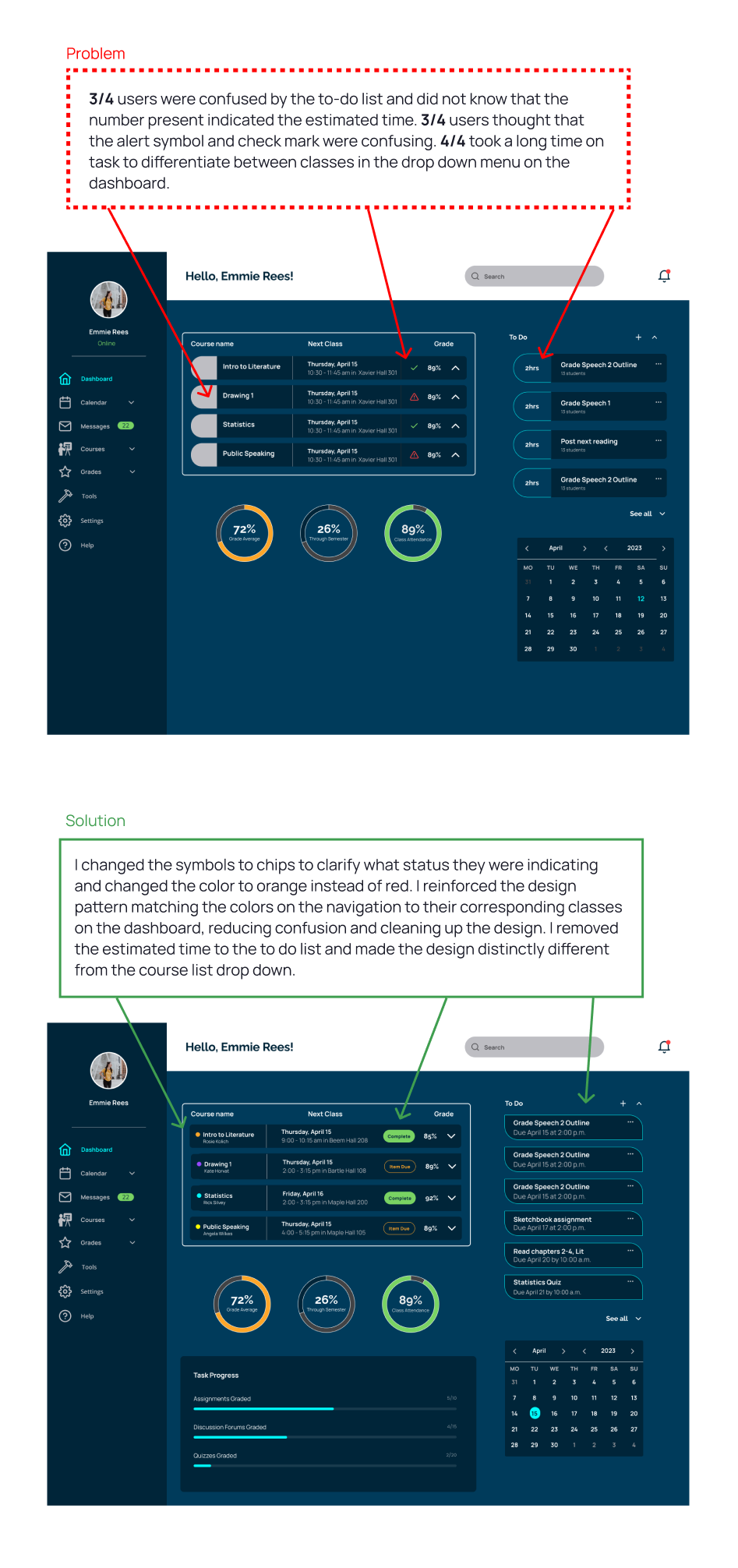
75%
of users were confused by the to-do list and did not know that the number present indicated the estimated time.
75%
of users alert symbol and check mark were confusing.
50%
of users thought the estimated time on the "To Do" list was stress full.
100%
of users took a long time on task to differentiate between classes in the drop down menu on the dashboard.


.png)